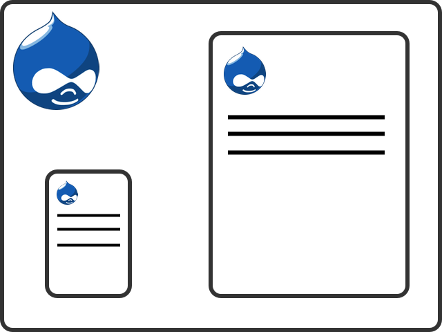
Resize me - I'm responsive and mobile first

I have been working with targeted CSS in Drupal themes for modern mobiles like the iPhone for some time now. xdeb.org has implemented it since early 2009, incidentally at the same time I got my first iPhone. This approach has worked well but now with over a third (34 percent) of the visitors to xdeb.org using Android or iOS devices it’s time to take them more seriously.
The first article I can remember reading on responsive web design is A List Apart - Responsive Web Design. One of the first bigger sites that has implemented a responsive web design is The Boston Globe, their new design launched in september 2011. Recent projects I have been working on have mobile first responsive web design as well and that made it almost impossible not to implement it here on xdeb.org.
Mobil first - Treat mobil as the basic/default platform that visitors will use. Start with making the site as good and fast loading as possible for mobils. Instead of forcing mobil users to download extra targeted CSS-files we turn it the other way.
Responsive web design - Don’t assume anything about screen size, resolution or window width. Make the site look good at any size and on any plattform (with a modern web browser).
I pushed the first version of the mobile first responsive web design to xdeb.org last week and after a number of tweeks I’m quite satisfied with the result. The xdeb.org theme is a Drupal Zen subtheme so I needed to add the responsive parts myself. If you want a Drupal base theme with built in support for responsive web design take a look at AdaptiveTheme and Omega.
A good web tool for testing is Responsive Design Testing by Matt Kersley. But do test on real devices as well. The feeling of a design changes a lot when you see it for real on an iPhone compared to in a narrow window.
How to deal with images well in responsive web design takes some thought and I will not touch much on it here. I recommend reading A List Apart - Fluid Images. You can also just add the CSS below, from the “Fluid Images” article, and hope for the best.
img {
  max-width: 100%;
}
To not just serve images that look smaller to small screens but also makes them smaller in bytes the Drupal module Adaptive Image looks really interesting. I will definitely try it out later on.
What I did for the xdeb.org Drupal theme
What I did for the xdeb.org Drupal theme was basically switching in what I earlier had in iphone.css and ipad.css and switching out the corresponding CSS to xdeb_narrow.css and xdeb_wide.css.
In the theme *.info file I start with the base CSS that will be loaded by all clients. Mobile clients with small screens will only load this CSS so the design is targeted to them. This is the “mobile first” part. In this example I have two CSS files, one for layout and one for content. In reality I normally have a bunch more.
; Base stylesheets
stylesheets[all][] = css/xdeb_layout.css
stylesheets[all][] = css/xdeb_content.css
For larger screens I then load CSS in two steps, narrow and wide. These contains a lot of floats and paddings, narrow floats the second sidebar and wide the first for example. Images start to float in narrow and their margin and paddings are adjusted.
; Responsive stylesheets
stylesheets[only screen and (min-width: 768px)][] = css/xdeb_narrow.css
stylesheets[only screen and (min-width: 1025px)][] = css/xdeb_wide.css
It’s easy to go a bit wild with the number of responsive stylesheets. The problem is that that will result in a lot of files to download for the client, not good for front end performance. Instead I decided to use the @media rule to add small amount of targeted CSS here and there in the basic CSS files. Some examples follows.
This targets all devices with a max device width of 1024 pixels, i.e. iPhone, iPads etc. The CSS increase the font size and tell webkit to not auto adjust the text size.
@media only screen and (max-device-width: 1024px) {
  #page {
    font-size: 1em;
    -webkit-text-size-adjust: none;
  }
}
This targets all devices with a min device width of 1025 pixels, i.e. notebooks and desktops. The CSS changes the look of the navigation menu, the basic version is for touch interfaces.
@media only screen and (min-device-width: 1025px) {
  #main-menu {
    float: left;
    clear: left;
    margin: 0;
    padding: 0;
  }
  …
}
If you care about old Internet Explorer versions put all the responsive stylesheet code in to a ie.css file and use conditional comments to target pre IE 9 versions.
; Always display wide CSS for old IE.
stylesheets-conditional[lt IE 9][all][] = css/ie.css