Add a iphone.css file to drupal.org
The drupal.org web site, nice as it is after the redesign, is not a pleasure to access on a mobile device like the iPhone. In issue #951114: Mobile phone support (iPhone / Android) there are some discussions and suggestions how to improve this. My contribution is a iphone.css file for drupal.org, see below or in the issue.
I have two simple goals for mobile devices:
- Avoid the need to zoom in and scroll sideways, making the text readable directly.
- Make the navigation and the search function touch friendly with larger buttons/fields and more spacing.
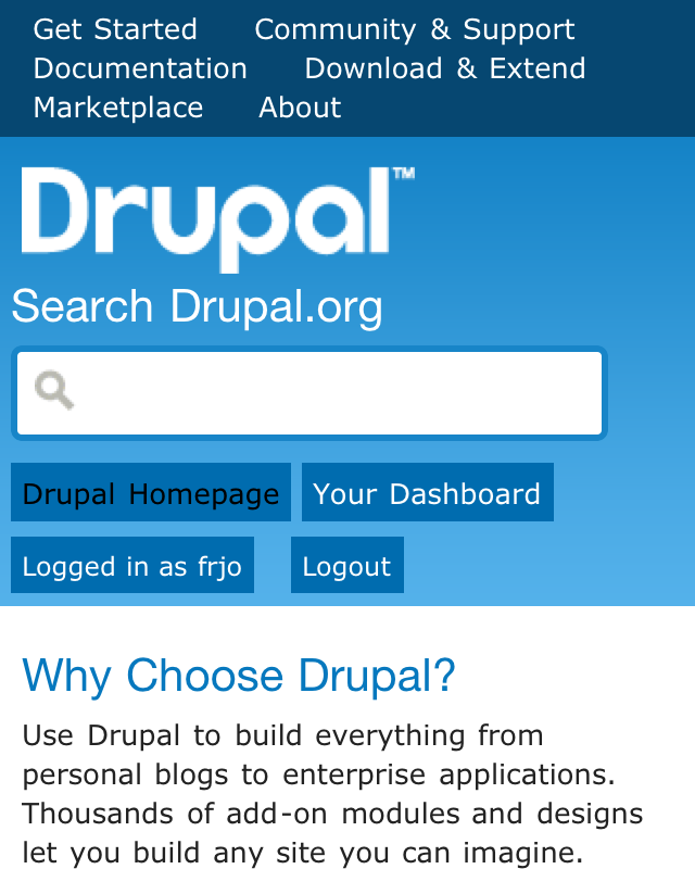
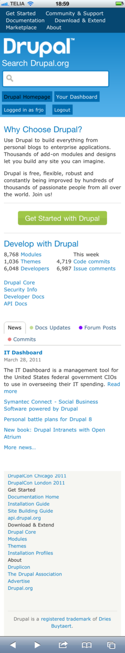
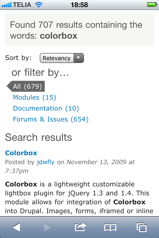
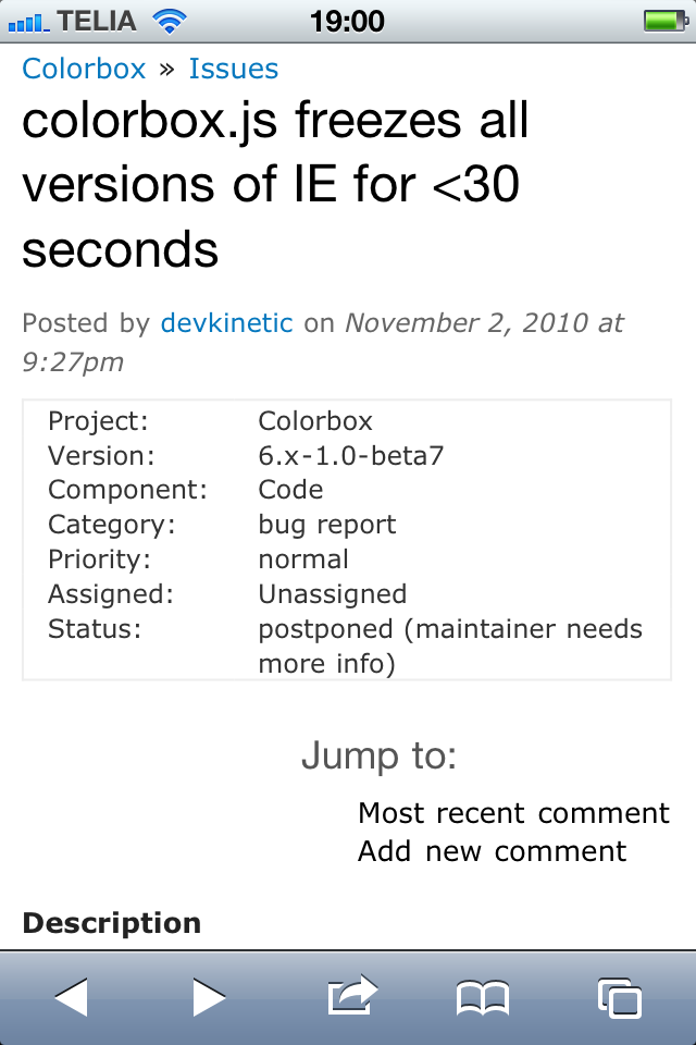
In the screenshots you can see the result of this first ruff draft for an iphone.css file for d.o. With a few lines of CSS we have made drupal.org a lot nicer to use with an iPhone.
If you are interested in helping out please go to the issue, try out and help improve the iphone.css file. There is a lot more that can be done!
P.S. Notice the apparent low quality look of the Drupal logo in the screenshot? A high quality version for high pixel density displays like the one on iPhone 4 would be neat.
Code in page.tpl.php to add the iphone.css file and set the viewport:
<!-- Start iPhone stuff -->
<link rel="stylesheet" type="text/css" media="only screen and (max-device-width: 480px)" href="http://drupal.org/sites/all/themes/bluecheese/iphone.css" />
<meta name="viewport" content="width=device-width" />
<!-- End iPhone stuff -->
The iphone.css file:
#page-inner,
#footer {
  margin: 0 10px;
}
#header {
  background-position: 0 0;
}
#header,
body.drupalorg-front #header,
#footer,
#page {
  min-width: 0;
  height: auto;
}
#header-right-inner {
  margin-top: 5px;
}
#header-content,
body.drupalorg-front #header-content,
#nav-masthead,
#site-name {
  padding-left: 5px;
  height: auto;
}
#userinfo {
  margin: 0 0 10px 0;;
}
#footer {
  padding: 10px;
}

#edit-search-theme-form-1,
#search-theme-form,
#search-theme-form-advanced,
#nav-header,
#nav-header ul,
#nav-header ul li,
#nav-masthead ul li,
#nav-masthead ul li a,
#userinfo {
  float: none;
  font-size: 1em;
}
#nav-header ul {
  padding: 5px;
}
#nav-masthead ul {
  padding: 15px 0;
}
#nav-header ul li,
#nav-masthead ul li,
#nav-masthead ul li a {
  display: inline;
}
#nav-masthead ul li {
  background: transparent;
  padding: 0;
}
#nav-masthead ul li a,
#userinfo a {
  background: #006caf;
  padding: 5px;
}

#nav-masthead,
#homebox.column-count-3 .homebox-column-wrapper,
.container-12,
.grid-1,
.grid-2,
.grid-3,
.grid-4,
.grid-5,
.grid-6,
.grid-7,
.grid-8,
.grid-9,
.grid-10,
.grid-11,
.grid-12,
.grid-footer {
  position: static;
  display: block;
  float: none;
  margin: 0;
  width: auto;
}

.content {
  word-wrap: break-word;
}

div.codeblock,
.node pre,
.node code {
  overflow: auto;
}

/* Search page */
.page-search #page-inner {
  position: relative;
}
.page-search #column-left #content-top-region {
  height: 11em;
}
#block-drupalorg_search-meta_type {
  position: absolute;
  top: 7em;
  left: 0;
}

#header-left-inner h2,
#header-left-inner .standfirst,
#search-theme-form-submit,
html.js #search-theme-form-advanced,
#search-theme-form-advanced,
#front-top-middle,
#front-middle,
#front-bottom-left {
  display: none;
}