Make a Drupal theme look better on the iPhone
I’m using Safari on my iPhone to browse the web more than I thought I would. Mobil Safari display pages very much like Safari on Mac OS X so it mostly works really well. A web design however rarely works well on both a big computer screen and a small handheld screen, even a high resolution one like on the iPhone.
I was not satisfied with the way xdeb.org looked on the iPhone. I wanted a simple way to improve it without the need for a separate theme or other more complicated solutions. My main goals was readable text and no sideways scrolling.
All I needed to know I found in the “A List Apart” articles Put Your Content in My Pocket and Put Your Content in my Pocket, Part II. There you can find a lot more information about making web design for the iPhone.
I created a special CSS file for the iPhone and used the link tag below to include it. The “max-device-width: 480px” part make computer browser ignore it since there screens are bigger than 480 pixels. This CSS file puts the sidebars below the main column making the site one column. I increased the spacing for the links in primary menu to make it easier to selects them. Added some padding and made the page width 600 pixels.
I then added a meta tag that sets the iPhone viewport to “device-width”. It makes the articles immediately readable without the need to zoom in.
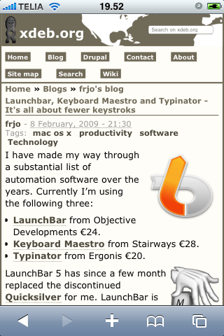
Open this blog on your iPhone to see the result or have a look at the screenshot.
I also did some testing with a Zen STARTERKIT theme and come up with the example code below. It makes the theme one column with a width of 600 pixels, about the same result you see here on xdeb.org. For a production site it needs a lot of work but I think it’s a good start.
Put this in the head section of your themes page.tpl.php file.
<!-- Start iPhone stuff -->
<link rel="stylesheet" type="text/css" media="only screen and (max-device-width: 480px)" href="<?php print $base_path . $directory .'/iphone.css'; ?>" />
<meta name="viewport" content="width=device-width" />
<!-- End iPhone stuff -->
Put this in a iphone.css file that you place in your theme folder.
/* $Id: iphone.css,v 1.0 2009/04/05 12:38:05 frjo Exp $ */

  #page
  {
    max-width: 600px;
    min-width: 600px;
  }

  #skip-to-nav
  {
    float: none;
  }

  #navbar
  {
    float: none;
    margin-right: 0;
    height: auto;
  }

  #search-box
  {
    width: auto;
    margin-right: 0;
    float: none;
  }

  #primary
  {
    margin-left: 0;
  }

  #secondary
  {
    margin-left: 0;
  }

/** content **/
  #content
  {
    float: none;
    margin: 0;
  }

  .sidebar-left #content-inner
  {
    padding-left: 0;
  }

  .sidebar-right #content-inner
  {
    padding-right: 0;
  }

  .two-sidebars #content-inner
  {
    padding-left: 0;
    padding-right: 0;
  }


/** sidebar-left **/
  #sidebar-left
  {
    float: none;
    width: 45%;
    margin-right: 0;
  }


/** sidebar-right **/
  #sidebar-right
  {
    float: left;
    width: 45%;
    margin-left: 20px;
  }

  .node
  {
    margin-bottom: 2em;
  }

/** List in nodes and comments **/
  .node .content ul,
  .comment .content ul
  {
    padding-left: 2em;
  }
  .node .content ol,
  .comment .content ol
  {
    padding-left: 3em;
  }
Update 2011-01-03: Changed the viewport meta tag from “width=600px” to “width=device-width”.